
In today's busy world, it is becoming more and more difficult to keep track of one's schedule and habits, as well as to find time for one's introspection.
B.Productive is here to the rescue.
B.Productive is an application designed to focus on the overall development of an individual which will help the user to maintain time-bound schedules, keep a track of habits, retrospect each day, and avoid distractions while focusing on his prioritized tasks.
The intent behind designing this application is to create a centralized platform where users can keep a complete log of all the activities they are doing so that it's easier to analyze and improve each day.
UX Researcher, UI Designer
October 2022 - November 2022
We started with a rough problem in mind to solve around the first week of October and eventually began to take surveys and do competitive analysis which gave us a very strong sense of the problem that we were aiming to cater to. Moving forward we brainstormed the ideas and provided them a shape by creating Information Architecture and User Flows. Next, we worked on the designing half starting with Low Fidelity designs, making rectifications, and eventually moving to High Fidelity. Once the designing part was over we focused on thoroughly testing our product with multiple users.

We opened a survey form with some common questions and problems regarding work productivity. More than 70 people answered the survey, below are the insights we got:
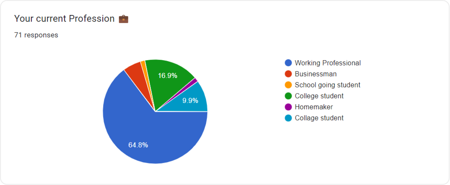


After analyzing the survey, we divided our target users into 3 Primary categories: Working Professionals, College students, and School-going students. For each category, we had a conversation with multiple individuals and collectively created the following User Personas.


We discovered several pain points that the user faces and how other applications are handling them. Moreover, we also found some places where the other applications were not focusing on and we saw an opportunity to fill that gap.

To move forward in the ideation phase it was really important to sum things us by creating an empathy map of what exactly our user says, thinks, does, and feels. This gave us a solid foundation to ideate on and start giving shape to the solution to the problems faced.

After defining our problem statement, I brought everything on the board and started to categorize things. After dividing everything, the most logical outcome was to divide the whole application into 4 major sections: schedule, habits, journal, and profile. Once we categorized the features, I made an information architecture out of it.


As soon as the information architecture was complete, we started putting it into action and collecting all the screens that might be required to fulfill our requirements for what we wanted to achieve as functionality.

Side by side, we also ideated out things on Zoom meetings and made notes of things that made sense and contributed towards the solution that we were aiming to provide.

Once the Ideation was complete we were all set to create Low-Fidelity wireframes, which will give an initial structure to the application, and on the basis of that, we can start testing and taking feedback.


After the completion of low-fidelity wireframes, we organized feedback sessions with multiple users and noted down the problems that they faced while navigating through the low-fidelity test prototype. We curated all the problems and rectified the the ones that will reduce the pain points and improve the flow of the application.


The aesthetics of the application were going to play a very important role in making things get done by the user. So our first instinct was to select a color that provides a sense of growth, health, and success. Eventually, we chose several variations of green color and finally decided to go with "Munsell Green". For the font, we wanted one that gives a friendly feel to use and we chose "Rubik".


After successfully completing all the previous steps it was time to give life to our low-fidelity wireframes by adding colors and fonts and components using the material you guidelines.


The last step of the User Experience process was to test our fully functional prototype with users and to see if what we are trying to convey through the interface is actually reaching the end-user or not.

According to research by the time we come to an age where we need to start taking decisions by ourselves, our ability to command our brain to do something is so degraded that the first response that we get is NO, moreover, our brain loves to get distracted, and on every single distraction, it induces dopamine. This clearly shows that our mind needs an external entity to tell us what to do and when to do.

